Cloning a Website: Lessons in Responsive Web Design

Introduction
Responsive web design is an essential skill for any front-end developer, as users access websites from devices of all shapes and sizes. To challenge myself and refine my skills, I decided to clone the T2 Tea website. Initially, I thought this project would be straightforward; after all, I was merely replicating an existing design. However, this journey turned into an eye-opening experience that taught me a great deal about creating responsive web applications using HTML, CSS, and JavaScript. Through this process, I learned to appreciate the small yet critical details that make a website not just functional but also engaging and accessible across various platforms.
Project Goals
The aim of this project was to:
- Recreate key pages of the T2 Tea website, including the Home, Products, and Product Detail pages.
- Implement responsive design principles to ensure the clone worked seamlessly on devices ranging from desktops to mobile phones.
- Deepen my understanding of layout structures, styling techniques, and JavaScript for interactivity.
- Gain insights into optimizing performance and user experience for modern web standards.
Key Features of the Clone
Home Page

- Navigation Bar: A fully responsive navigation bar that adjusts layout and content for different screen sizes, ensuring intuitive navigation regardless of the device.
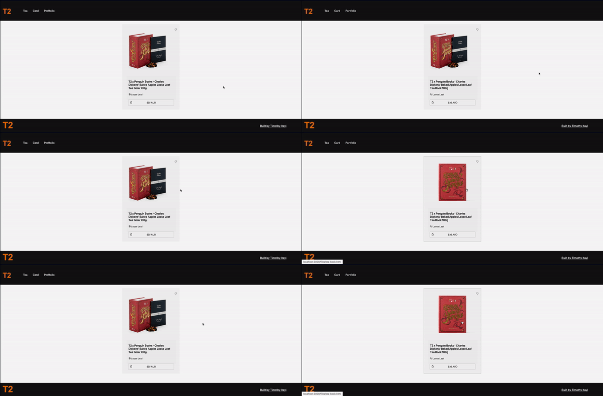
- Cards: Product cards mimicking T2 Tea’s design to showcase products, pricing, and features in a clean and visually appealing manner.
- Carousel: A responsive carousel highlighting key products with smooth transitions and adjustable settings to adapt to various screen dimensions.
Products Page
- Product Cards: Detailed cards containing an image, product name, and price, optimized for both grid and list layouts. These cards were styled to maintain consistency with the original T2 Tea design while being flexible enough to adapt to user preferences.
Product Detail Page
- Dynamic Layout: Displays detailed product descriptions, pricing, and features while adjusting spacing and images dynamically for smaller screens to improve readability and user interaction.
Tools and Technologies Used
- HTML & CSS: For structuring and styling the website’s layout and ensuring cross-browser compatibility.
- *avaScript: To manage interactivity, including the carousel, side navigation, and responsive components.
- Figma: Used to structure and plan the design before coding began, providing a clear roadmap for development.
- W3Schools: A valuable resource for clarifying CSS concepts, exploring new techniques, and reinforcing best practices.
Challenges Faced and Lessons Learned
1. Understanding Flexbox and Grid Systems
- While cloning the T2 Tea cards and product layouts, I gained a deeper understanding of using Flexbox and CSS Grid to create adaptable designs. These tools became indispensable for maintaining proper alignment, spacing, and responsiveness across devices.
2. The Importance of Media Queries
- Initially, I underestimated the complexity of ensuring a site’s responsiveness. Writing efficient media queries to handle font sizes, padding, and layout changes taught me how vital it is to test designs across multiple breakpoints. This improved my ability to anticipate potential issues and craft scalable solutions.
3. Integrating JavaScript for Interactivity
- The navigation bar and carousel components required careful integration of JavaScript to ensure smooth transitions and responsiveness. This solidified my knowledge of DOM manipulation, event listeners, and dynamic content updates.
4. Iterative Improvement Using Design Tools
- Introducing Figma into my workflow significantly enhanced my planning process. Visualizing the structure and pinpointing areas needing improvement helped me work more efficiently and avoid redundant coding.
5. Balancing Aesthetics and Functionality
- Striking a balance between visual appeal and usability was challenging but rewarding. Ensuring that every element contributed to both the user experience and design cohesiveness taught me to approach development with a holistic perspective.
Outcomes
- Improved understanding of responsive design principles and best practices, especially for real-world applications.
- Gained experience using CSS techniques like Flexbox, Grid, and media queries to build scalable and maintainable layouts.
- Enhanced my productivity and organization by incorporating Figma for pre-development planning and workflow optimization.
- Developed a deeper appreciation for the effort required to ensure a polished, responsive user experience, especially for e-commerce platforms.
- Strengthened my ability to troubleshoot and solve problems efficiently, ensuring a seamless development process.
Conclusion
Cloning the T2 Tea website was more than just a technical exercise; it was a valuable learning experience that highlighted the intricacies of responsive web design. By challenging myself with this project, I not only honed my front-end development skills but also learned to appreciate the effort and detail that goes into crafting modern web applications. If you’re looking to improve your skills, I highly recommend cloning a website — it’s a practical and rewarding way to learn!